ACTIVE Network Responsive Marketing Emails
About
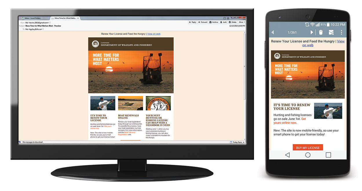
One of ACTIVE Network's many responsibilities included providing online campsite registration services for numerous state and federal campgrounds in the United States, such as the National Park Service and the Louisiana Department of Wildlife and Fisheries. During my 8-month co-op term there, one of my many tasks that I took on was to create a series of responsive, mobile-friendly marketing emails and templates for that department of the company. These were mainly based off of the designs of their existing non-responsive emails, but part of this task was to also revise their designs, often adding in elements such as social media icons.
Note that as I was mainly responsible for the design and layout, with the expectation that the content would be further modified by another person afterwards, many of the links in these HTML files do not lead anywhere.
Process
For each email, I was given their existing non-responsive HTML email newsletter template; for Email 1, this was the three-column design. My task was to change it to make it responsive for devices that support viewing responsive emails. To experiment with how it should look on mobile devices, I quickly drew wireframes on paper to experiment.

Then, I coded a new template from scratch using a text editor, incorporating the former design elements into the new one. Next, I put the email design through rigorous testing; I uploaded it to Campaign Monitor and sent it to different email addresses I controlled, viewing them on as many clients – both on desktop and mobile – as possible. I worked closely with my marketing manager to ensure that the design was built to specifications and that she was happy with the design.
Outcomes
Responsive emails combine the complexities of both responsive web design and email design, because grids and media queries must be combined with table-based design layouts. To prepare for creating the first email, I took on the initiative to quickly learn how to create responsive emails, based on my existing combined knowledge of creating non-responsive emails and valid responsive web pages in HTML5/CSS3. This design worked with all popular email clients, and the market manager was very satisfied with the quality of the email designs. I later took on additional responsive emails to work on, which allowed me to get better at it – the time it took me to create and test one email was reduced from a few days (on and off, while working on other projects at the same time), down to a few hours.